An identity that stands on its own
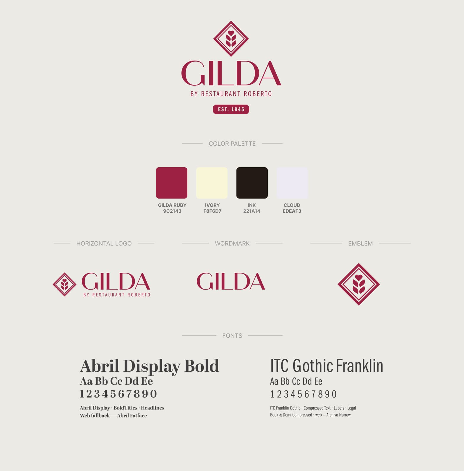
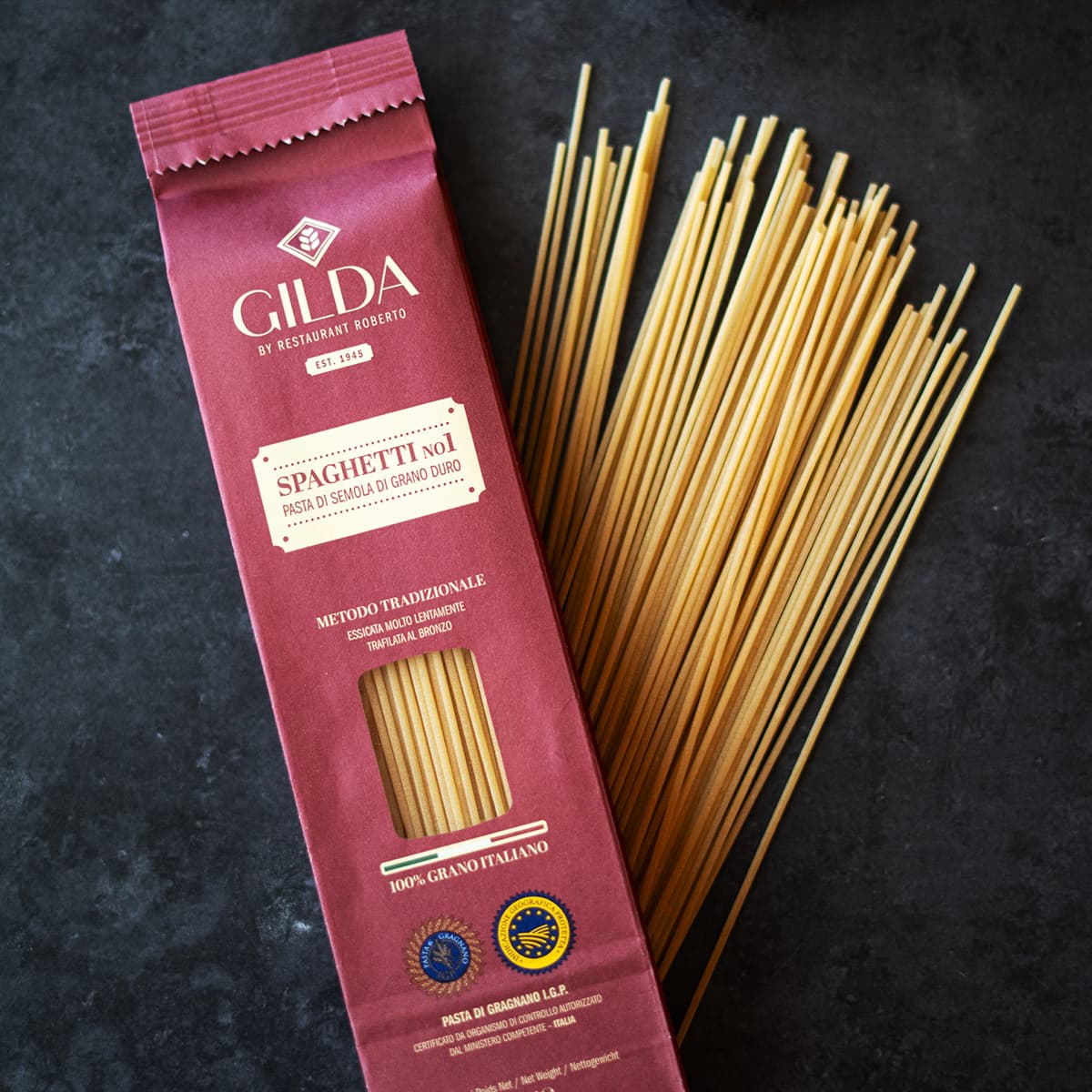
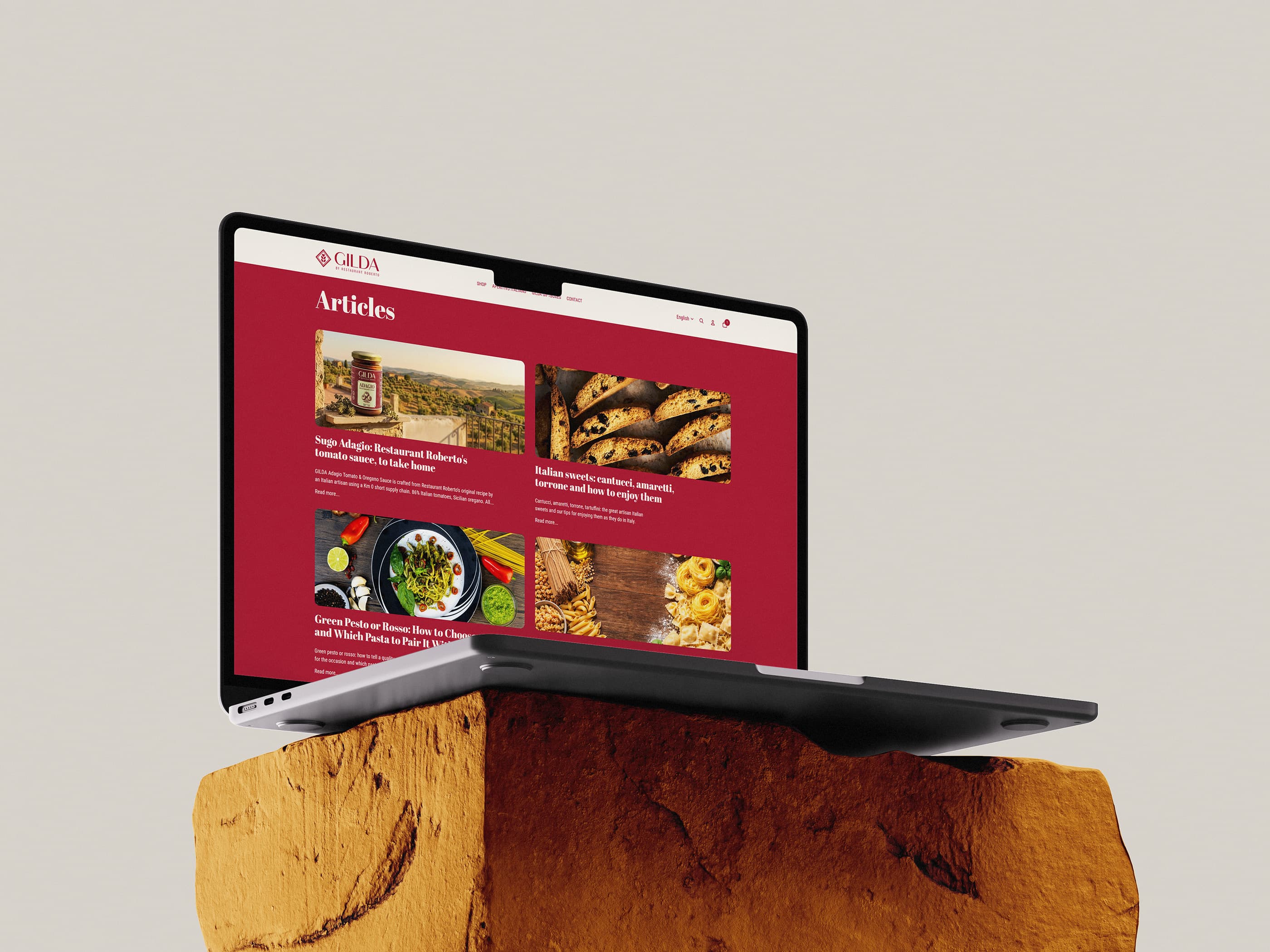
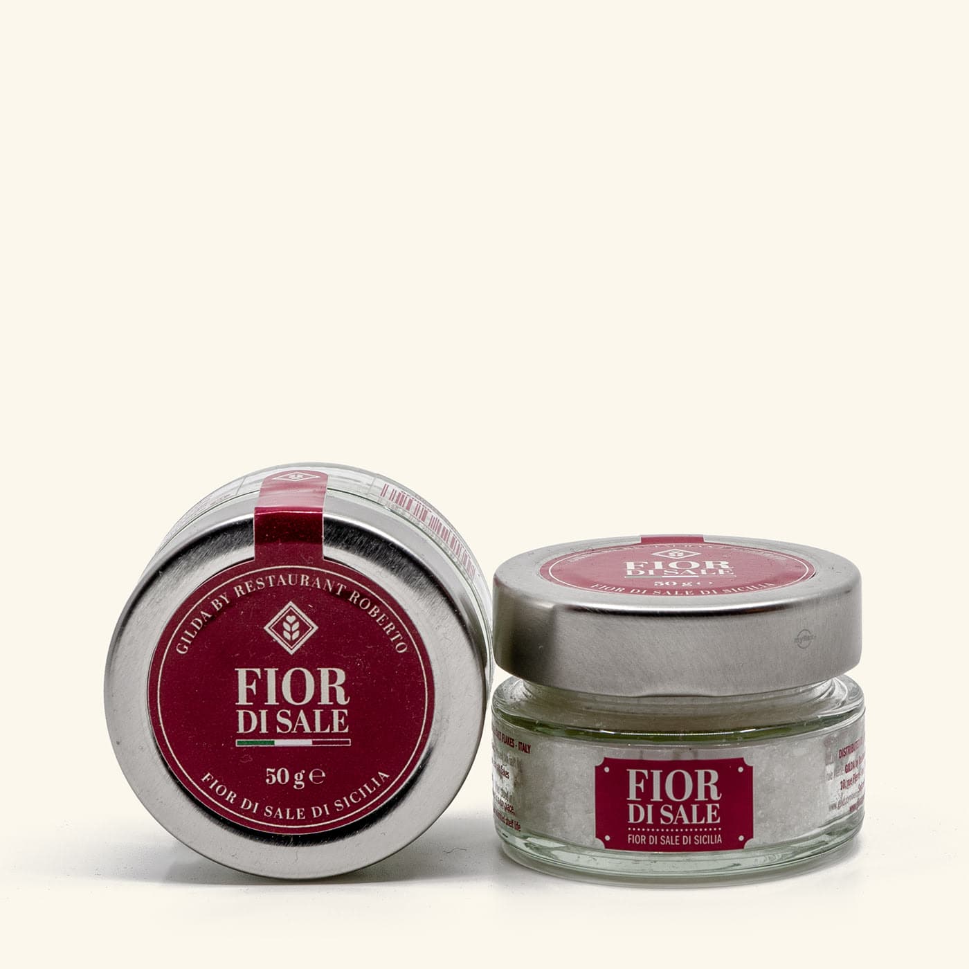
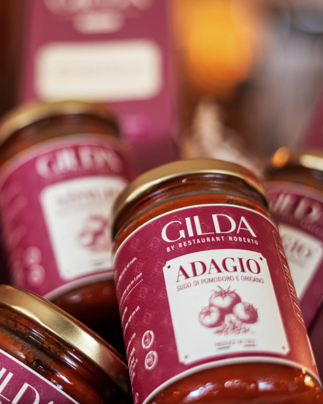
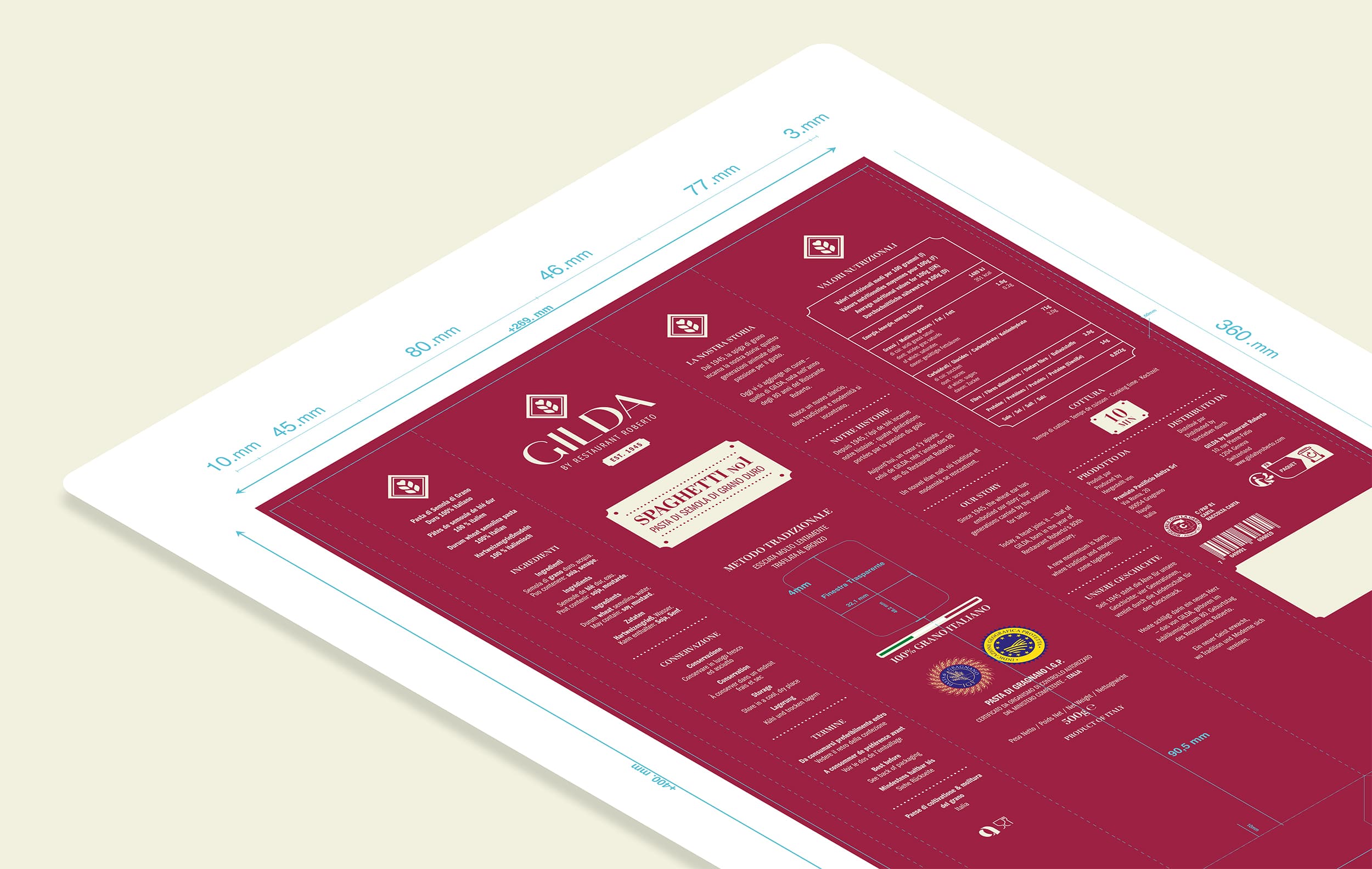
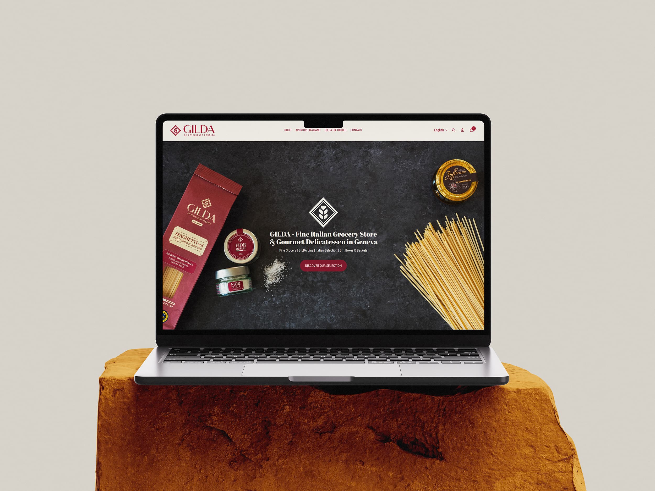
Gilda had to read as a maker with its own history, not as a restaurant's side project. The emblem, wordmark and horizontal lockup were drawn as one system on a bordeaux and cream palette, with Abril Display carrying the headlines and Franklin Gothic doing the work that has to stay legible at label size.