Foundations
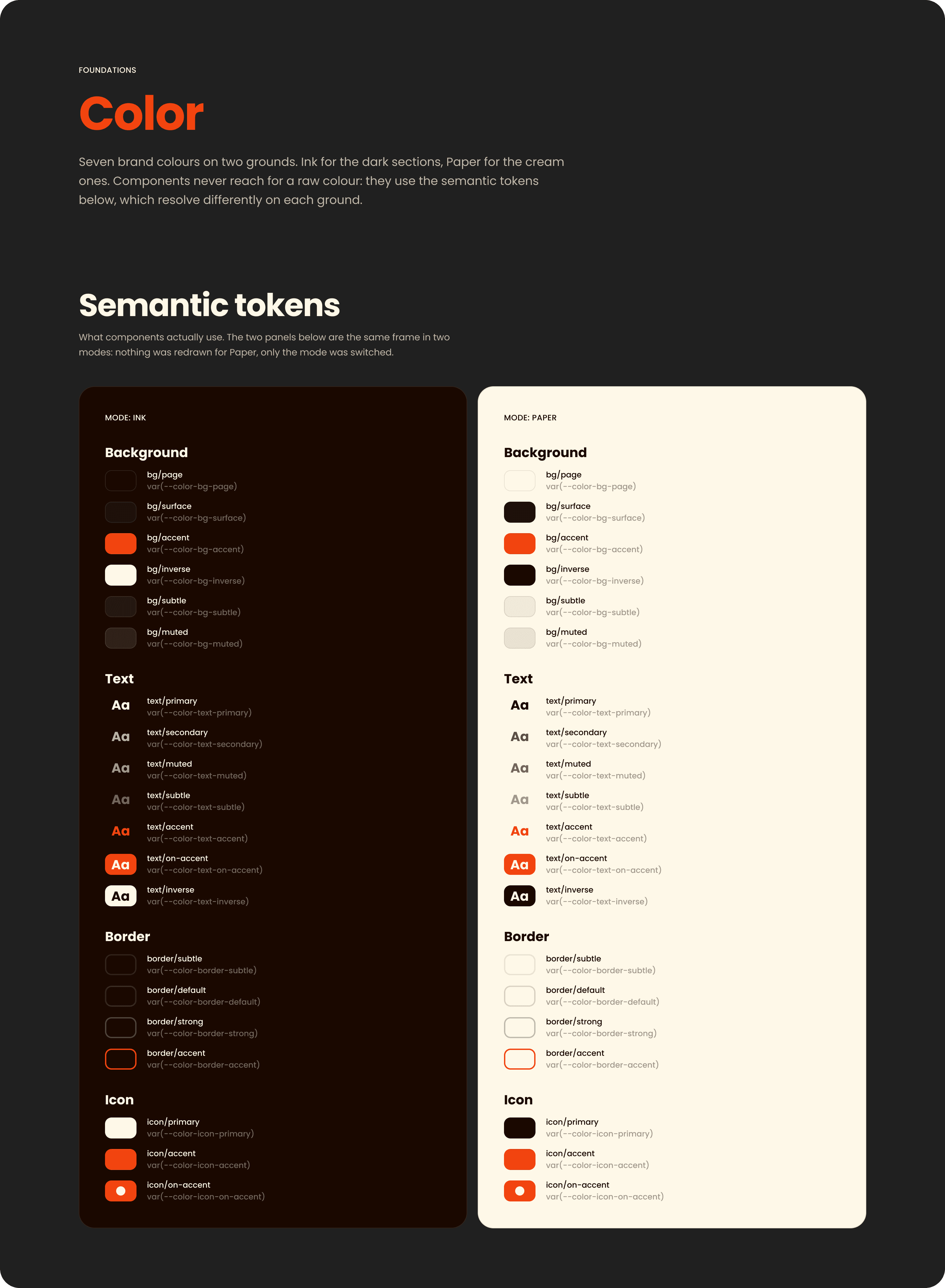
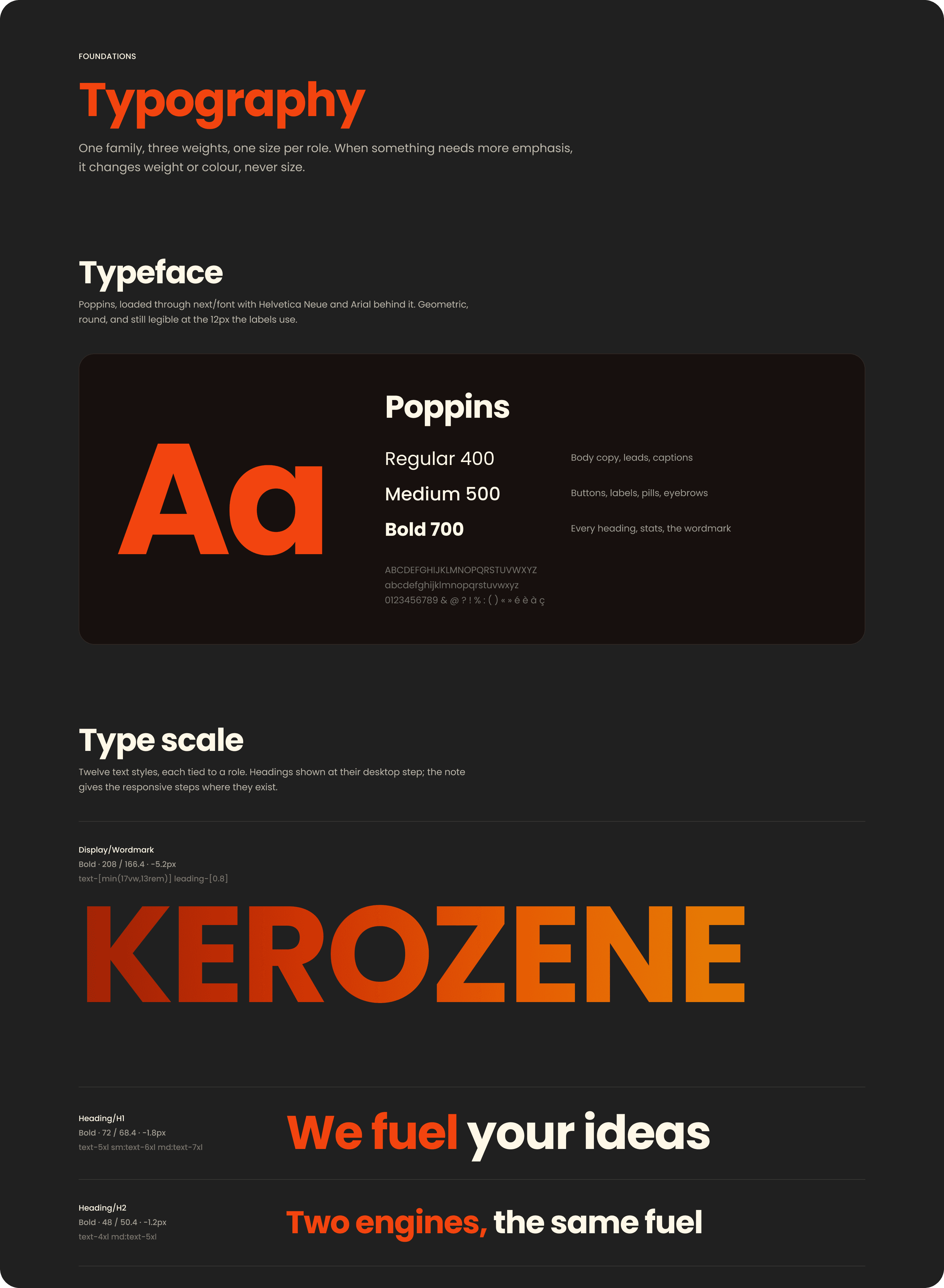
Colour, typography, spacing, radius, elevation and brand, as variables and styles. Semantic tokens point to the base palette, so switching a frame from Ink to Paper changes every colour inside it at once, without redrawing anything.

The studio's design system
One system behind everything Kerozene designs: tokens, components and documentation, shared by every application, the website among them.
A brand that lives across several applications cannot rely on everyone remembering the same decisions. Without a shared system, every new screen starts from scratch and drifts a little further from the last. Kerozene needed a single source for every decision, readable by designers and developers alike.
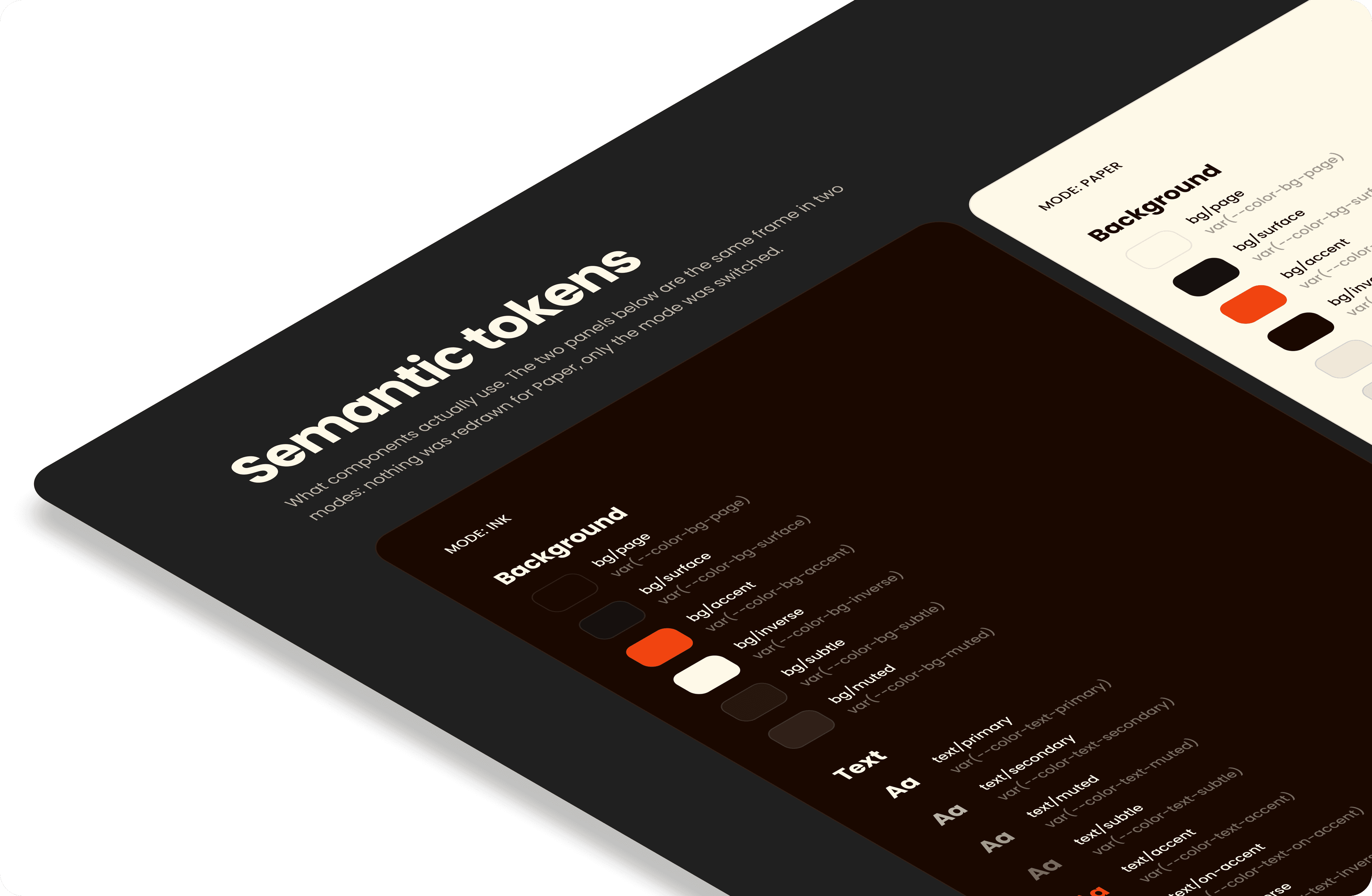
Every colour, spacing step, radius, shadow and text style is a named token, and every component is assembled from those tokens alone. Each token carries its equivalent in code, so what a designer picks in Figma is exactly what a developer writes.
Colour, spacing, radius and type as variables, each with its equivalent in code.
Ink and Paper: placed on either ground, a component adapts its copy and borders on its own.
Larger components are made of smaller ones, so a change travels everywhere they are used.
Every token and component shown on the ground and in the use it was designed for.
Colour, typography, spacing, radius, elevation and brand, as variables and styles. Semantic tokens point to the base palette, so switching a frame from Ink to Paper changes every colour inside it at once, without redrawing anything.
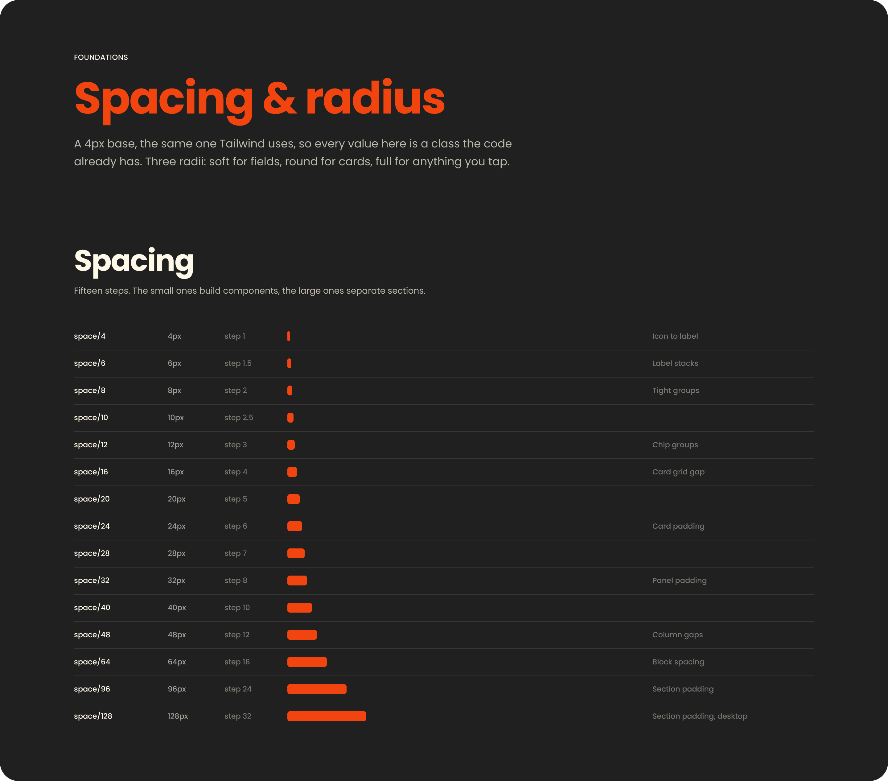
A 4px base shared with the code, in fifteen steps: the small ones build components, the large ones separate sections. Every bar on the page is bound to its variable, so changing a token redraws the documentation as well.
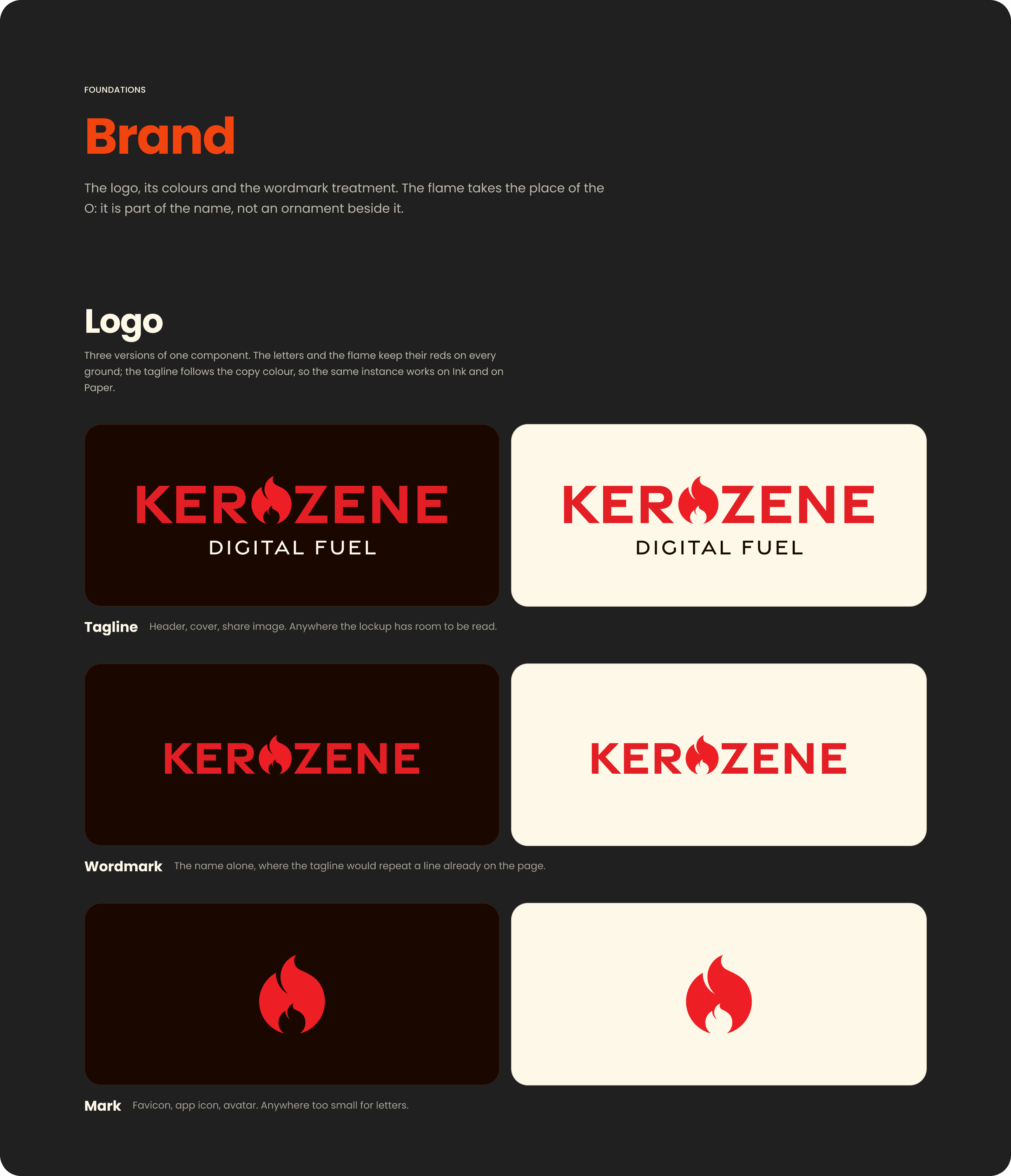
Tagline, wordmark and mark are three variants of one component. The letters and the flame keep the logo reds on every ground, while the tagline follows the copy colour, so a single instance reads on Ink and on Paper alike.
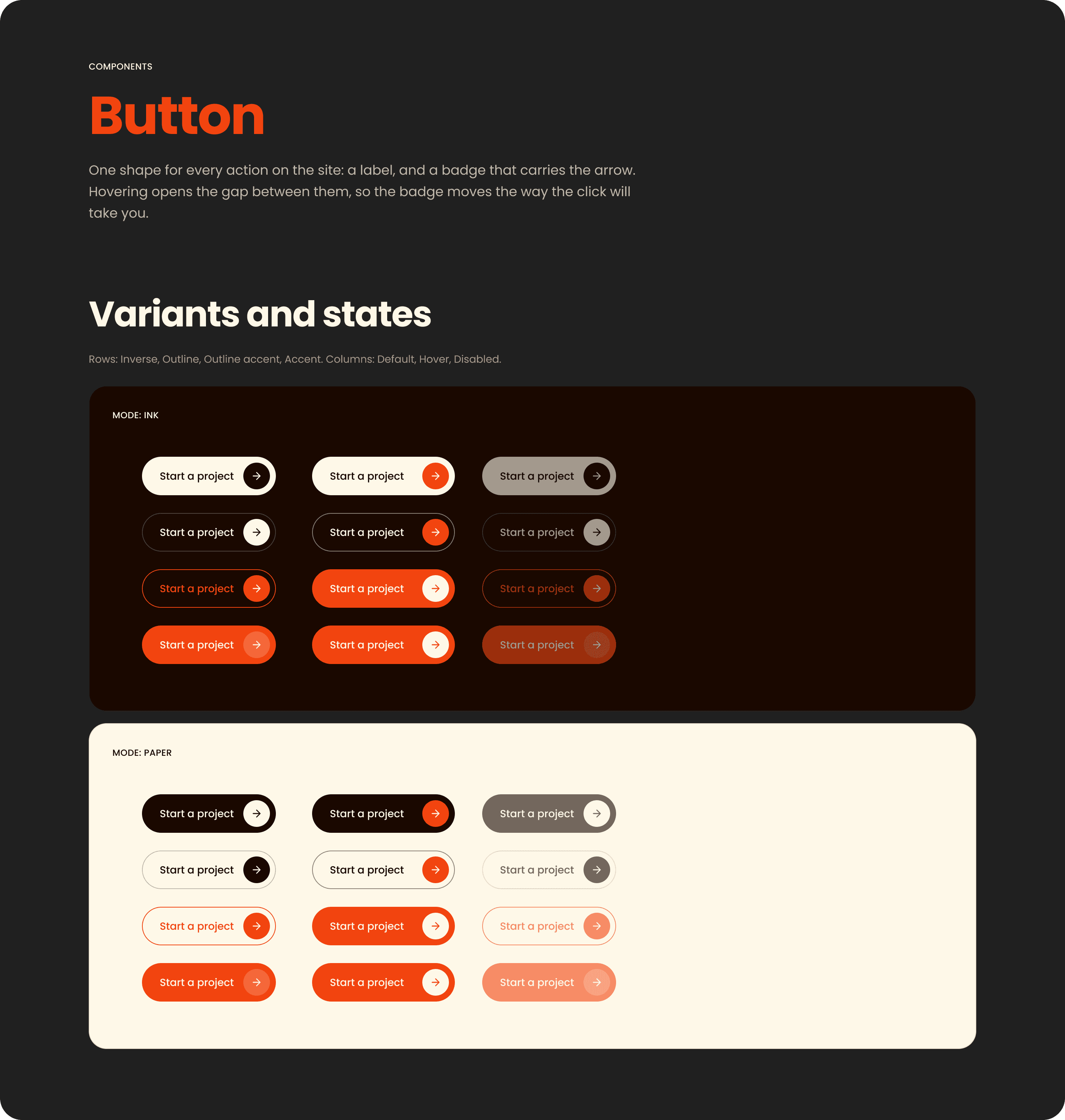
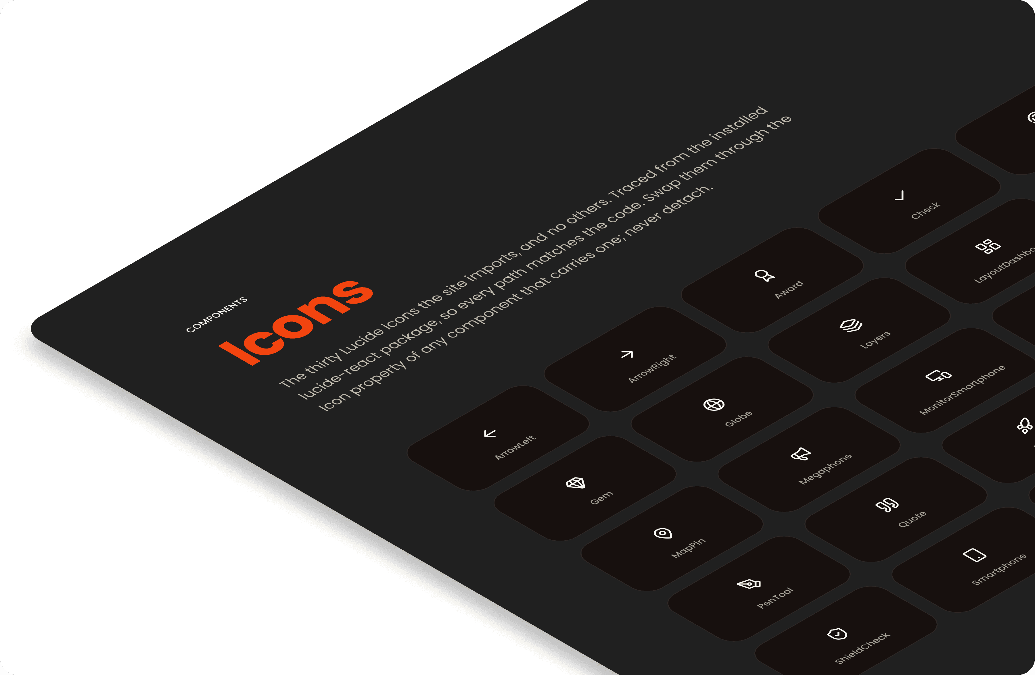
A complete library, from the smallest atom to whole sections: icons, buttons, tags, avatars, form fields, navigation, service, case and testimonial cards, stat tiles, accordions, headers and footers. Each comes with its variants and states, and each is built from the same tokens, so the light and the dark version of a component are one and the same, placed on two grounds.