An identity made for the campaign
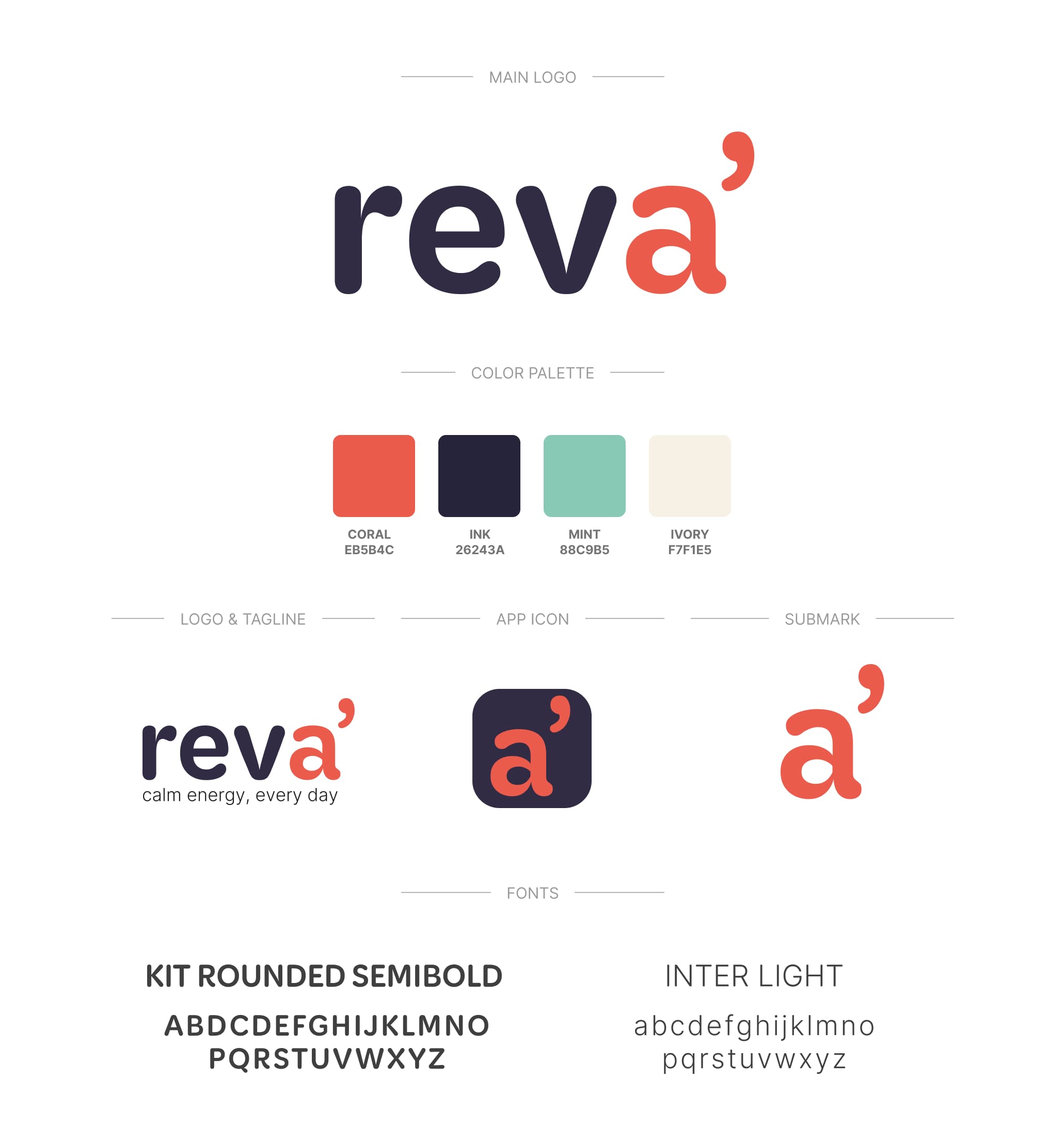
Mint, coral and deep navy against cream, with soft geometric type: warm enough to read as wellness, high-contrast enough to stay legible in a busy feed. The identity was designed from the outset to work in campaign.

Adaptogen drinks, self-initiated
How a contemporary wellness brand introduces its flagship drink in a feed that is already full.
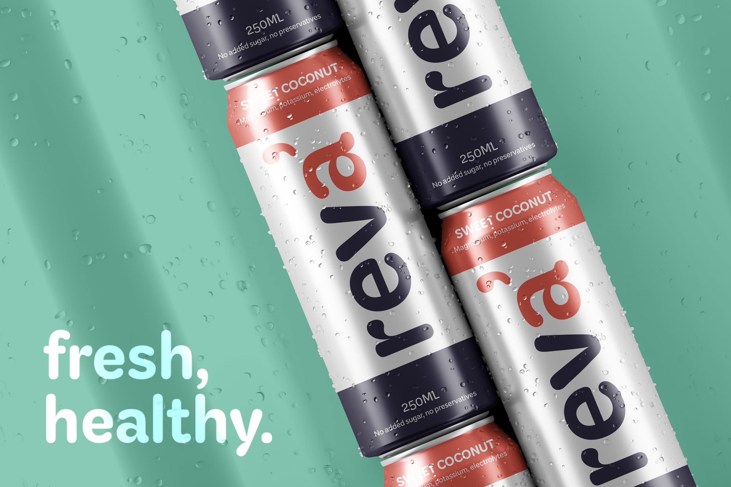
Reva sells calm energy: adaptogen drinks with L-theanine, ashwagandha and ginger, no added sugar. A subtler promise than a conventional stimulant, without the side effects that usually come with one. The brand and its social placements set out to beat the compulsive scroll, in a place where a few seconds are enough to move on.
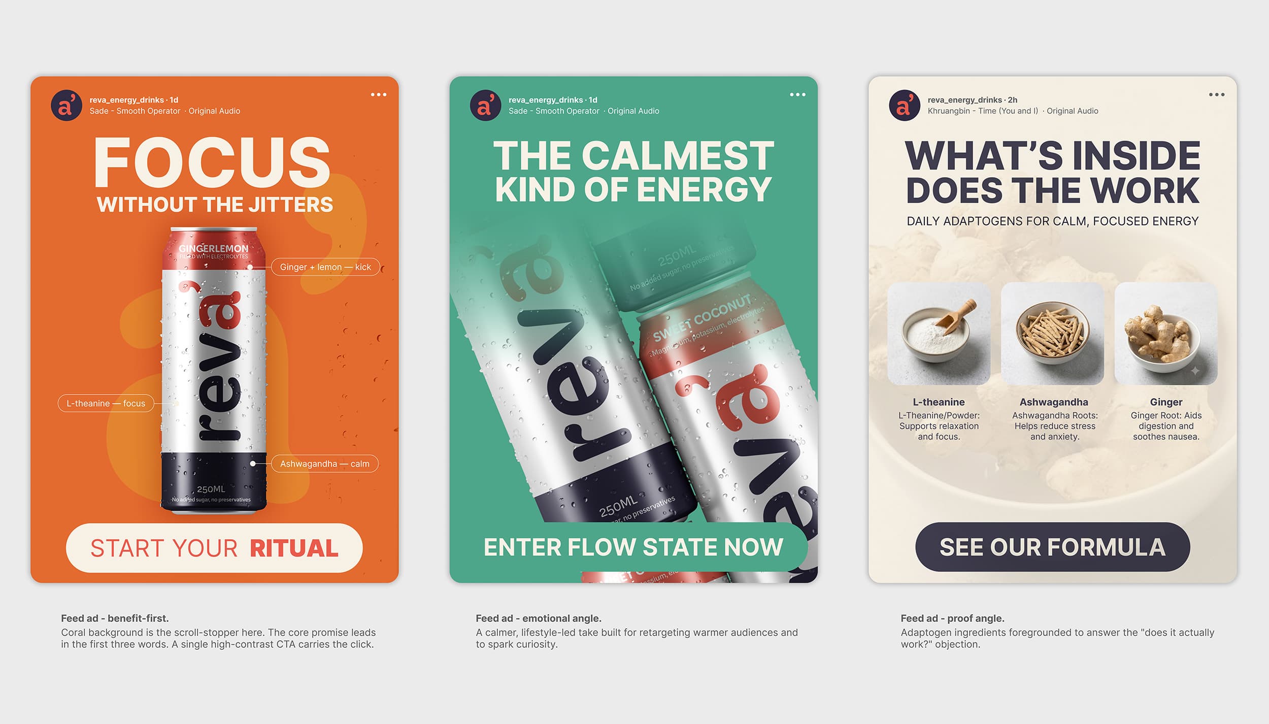
A single ad framework with the message as the only variable: one bold headline, the can as hero, one high-contrast call to action, and brand colours picked for stopping power. Three variations lead on feeling, benefit and proof, so a test measures the message rather than the layout.
The brand basics a launch needs, and nothing more.
One headline, can as hero, one clear action.
Colour chosen for stopping power in a busy feed.
Variations that isolate the message, not the design.
Mint, coral and deep navy against cream, with soft geometric type: warm enough to read as wellness, high-contrast enough to stay legible in a busy feed. The identity was designed from the outset to work in campaign.
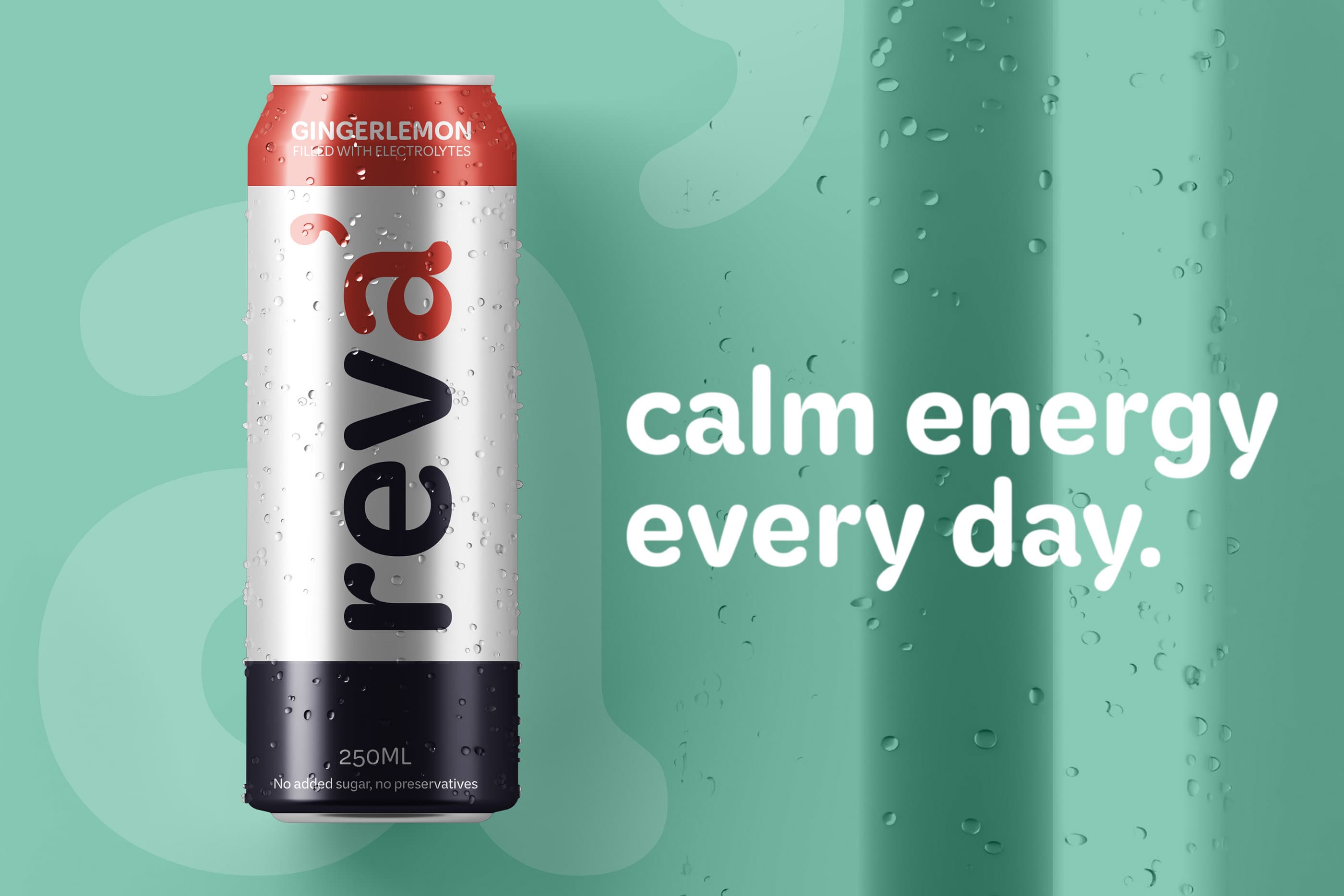
The line that sums up what Reva offers: energy, without the codes a stimulant usually comes with. Simple enough to carry the whole campaign.
The structure stays identical, only the message changes. One ad leads on feeling, one on benefit, one on proof. Holding the design constant means a comparison is about the thing that matters: the message.