All cases

Shoyu

Rooftop sushi bar, self-initiated

One mark stretched across a rooftop bar, a juice line and a takeaway box, without becoming three brands.

Brand identityPackagingArt directionConcept
Project
Shoyu, self-initiated concept
Sector
Sushi bar, rooftop & takeaway
Scope
Brand identity, packaging & collateral
Type
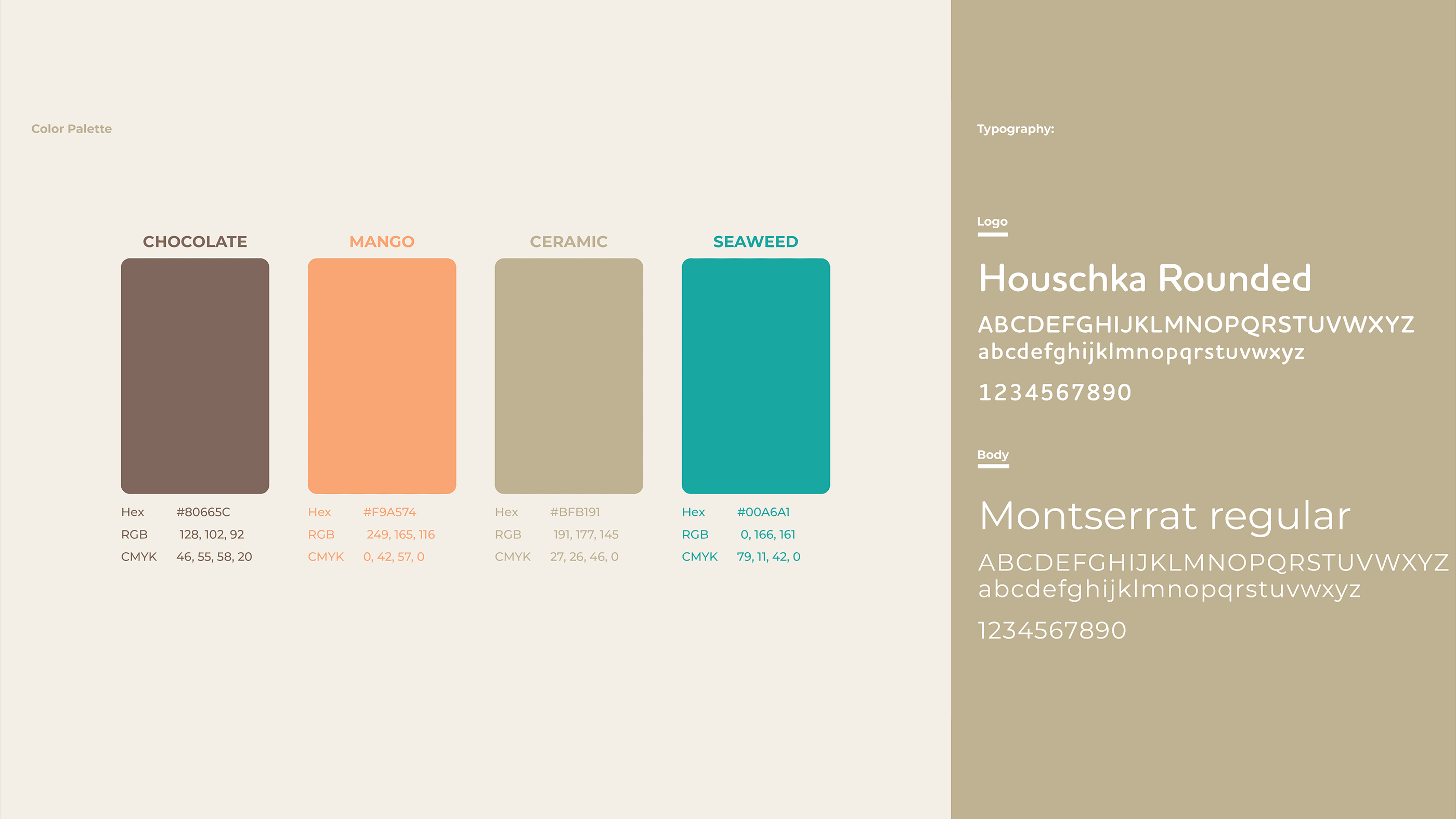
Houschka Rounded, Montserrat
Built with
Illustrator, Photoshop, After Effects
The brief

Three businesses that share a door

A rooftop sushi bar, a cold-pressed juice line and a takeaway box are three different purchases made in three different moods. Each has to be told apart at a glance, on a facade, on a shelf, in a paper bag, and none of them can afford to look like it came from a different company.

  • 01A rooftop bar and a takeaway box sit at opposite ends of one brand
  • 02Divisions that separate on a shelf without splitting the identity
  • 03A mark that has to hold at facade size and at stamp size
The approach

One mark, three grounds

The identity is a single X: crossed chopsticks carrying four icons, a fish, a sun, a heart and a cocktail glass. The menu, the roof, the welcome and the bar. The lockup never changes; only the colour under it does. Chocolate and ceramic for the bar, seaweed for the beverages, mango for the boxes, so colour does the dividing and the mark does the uniting.

  • Mark

    Four icons on crossed chopsticks: fish, sun, heart, glass.

  • Divisions

    One lockup, three grounds. Colour separates, the mark unites.

  • Pattern

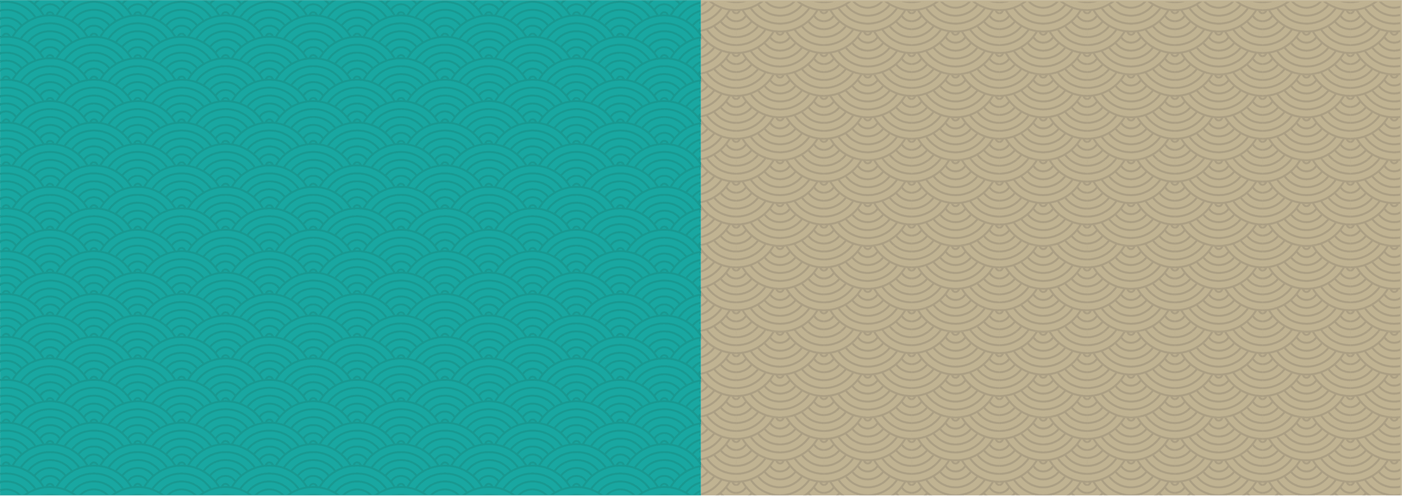
    A seigaiha wave that holds embossed, printed or flat.

  • Collateral

    Signage, cards, and a loyalty card stamped with its own fish.

The work
01

A mark that reads from the street

Four icons hung on crossed chopsticks: the fish for the menu, the sun for the roof, the heart for the welcome, the glass for the bar. Reduced to a lit disc on a facade it still reads as all four, and at loyalty-stamp size a single one of them carries the whole brand.
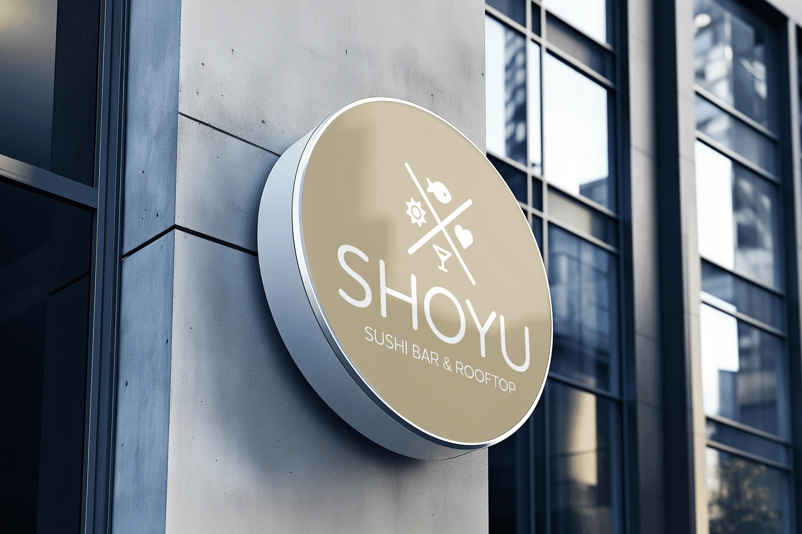
The Shoyu disc sign mounted on a building facade
02

Three lockups, one signature

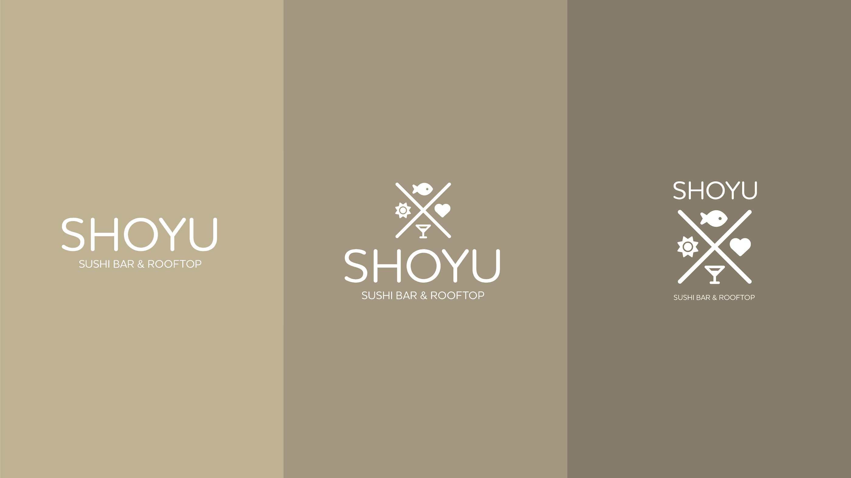
Wordmark alone, mark above wordmark, wordmark above mark. Three arrangements for three situations, a bar menu, a bottle label, a box lid, each holding the same proportions. They read as one signature written three ways rather than as three logos.

The three Shoyu lockups: wordmark, mark above wordmark, wordmark above mark
03

A wave that survives every process

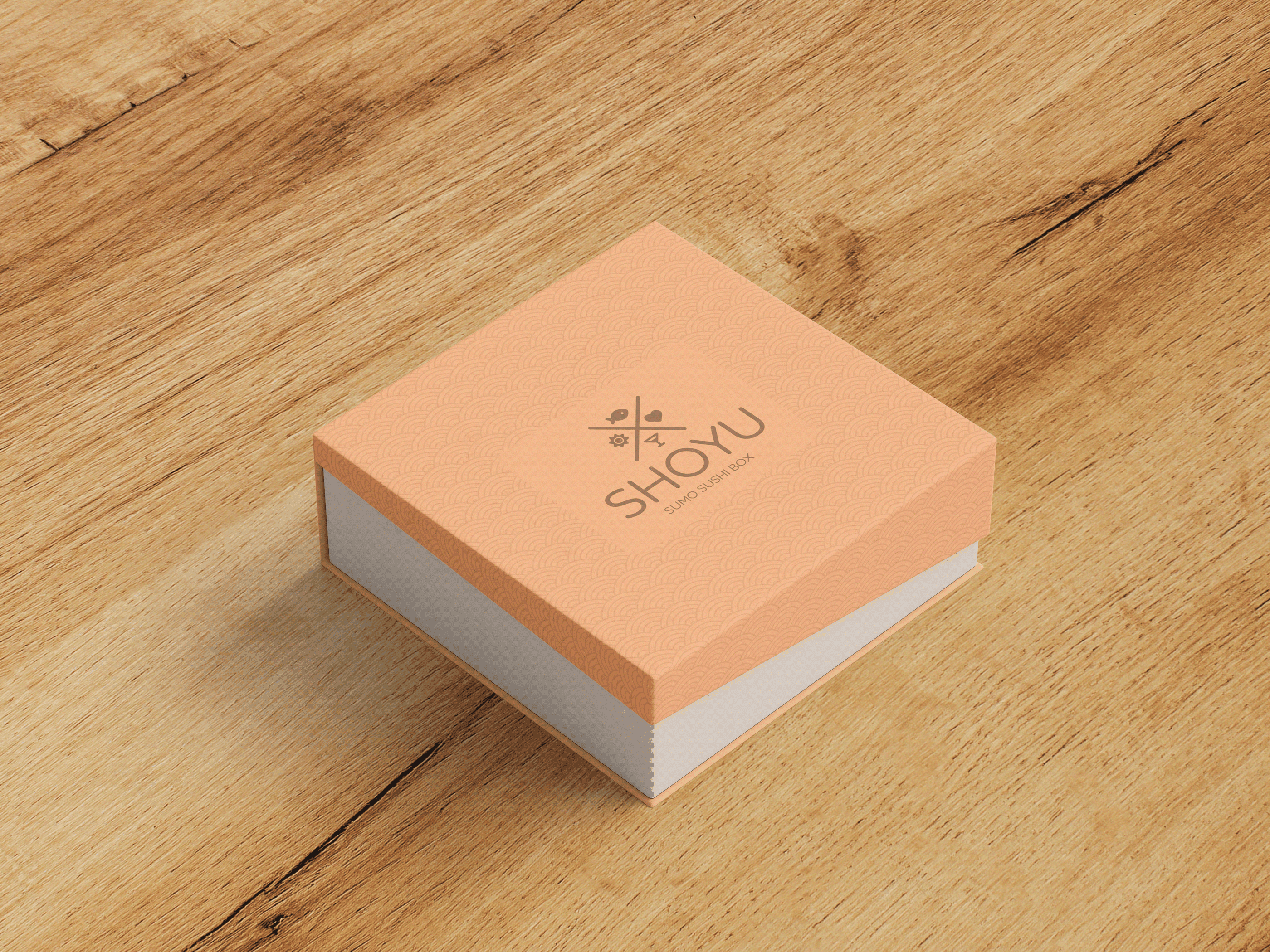
The seigaiha wave runs underneath everything as the brand's texture. On the takeaway box it is embossed rather than printed, so the pattern is in the light before it is in the ink: mango on white board, the lockup reading Sumo Sushi Box.

The mango Sumo Sushi Box with the seigaiha wave embossed into the lid
04

The juice line is its own product

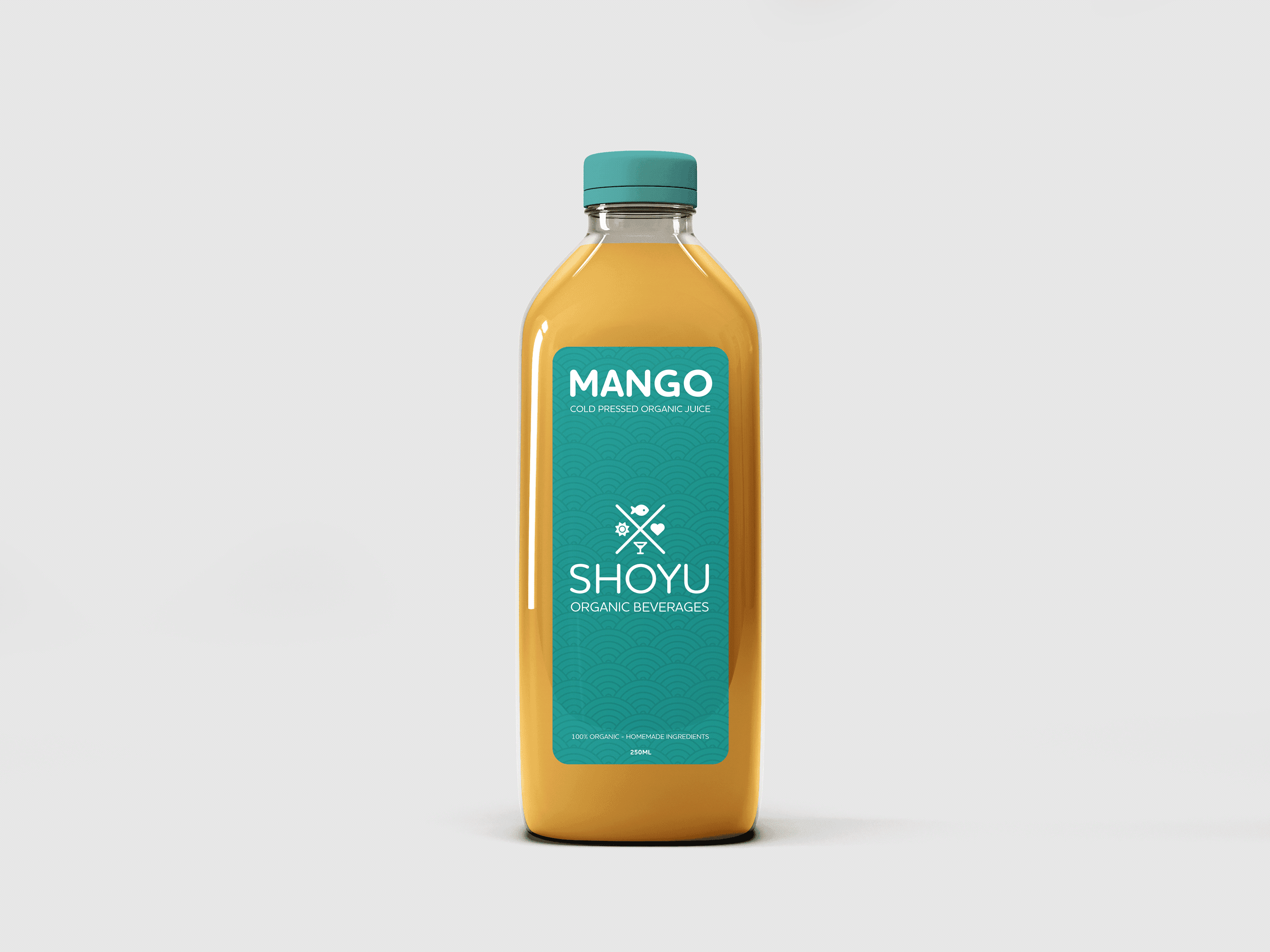
Cold-pressed organic juice, 250ml, labelled seaweed against mango. It carries the full lockup and the same wave, but the colour flips: the bar's warm neutrals would have made it look like merchandise from the restaurant instead of a drink you buy on its own.

Shoyu Organic Beverages: mango cold-pressed juice with a seaweed label
05

Paper that keeps people coming back

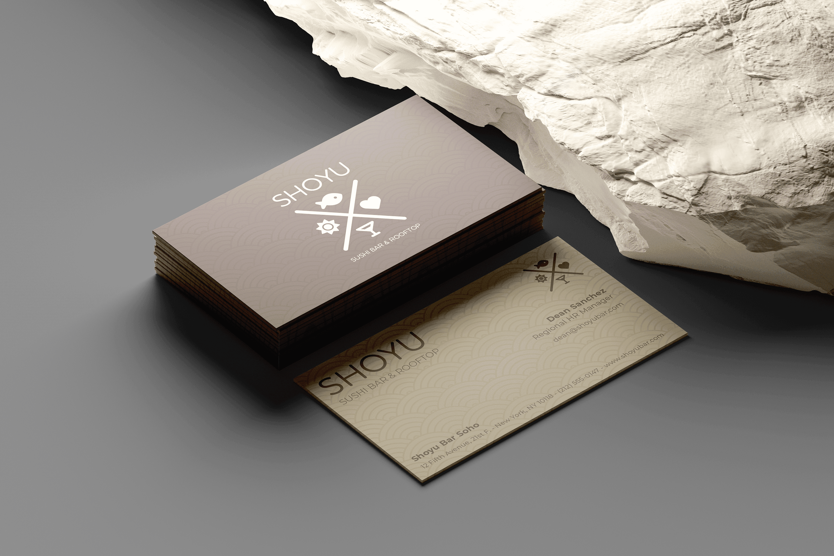
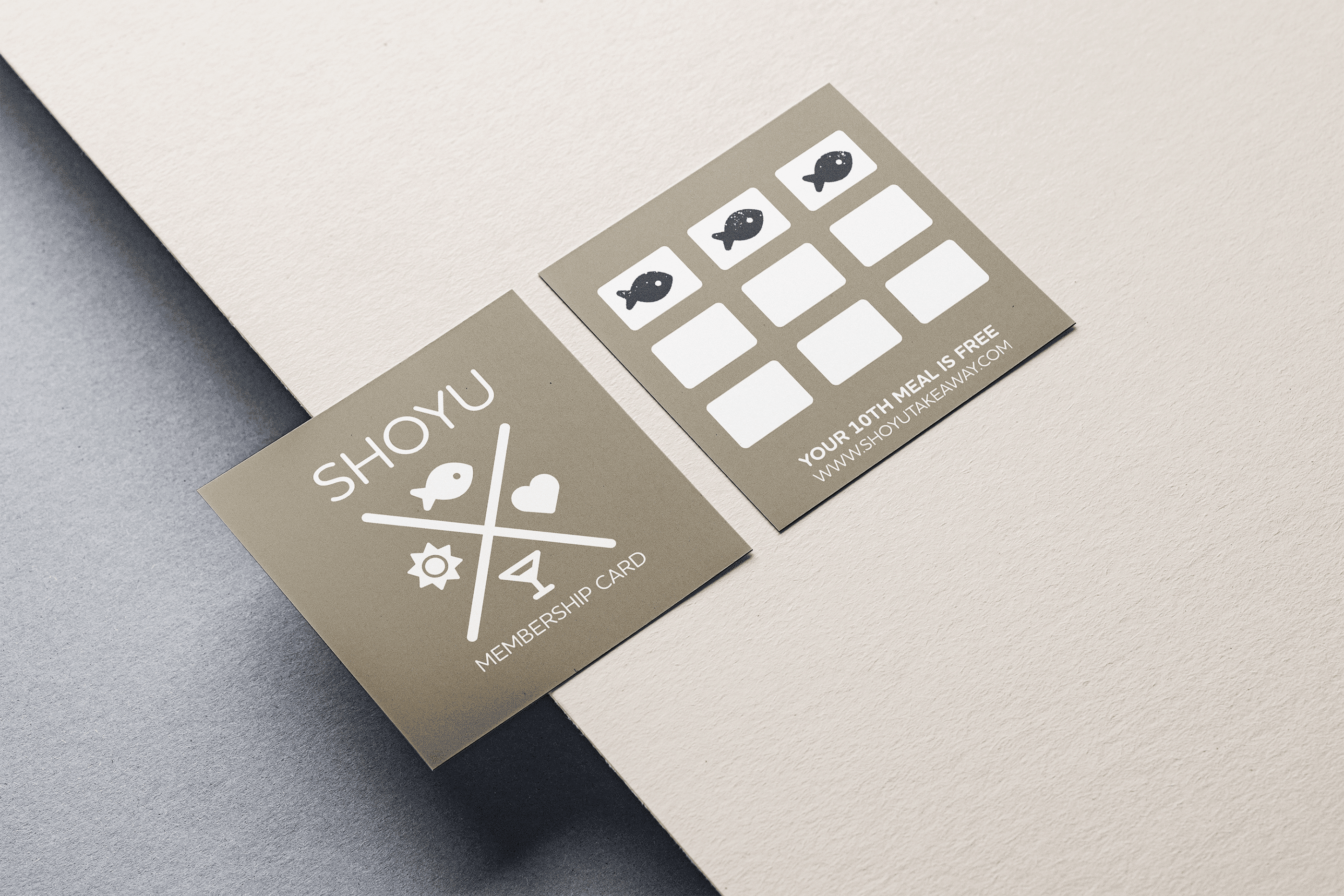
Business cards on ceramic and chocolate with the wave sitting under the type, and a membership card that stamps itself with the mark's own fish: ten meals, the tenth free. This is where the identity pays for itself, because the icon people collect is the icon on the door.

Shoyu business cards, ceramic and chocolate, with the wave under the type
The Shoyu membership card, stamped with the mark's fish icon
The seigaiha wave pattern in seaweed and in ceramic
The Shoyu palette: Chocolate, Mango, Ceramic and Seaweed, with Houschka Rounded and Montserrat